React Dark mode using TailwindCSS
Implement dark mode using TailwindCSS in your React application


React is a free, open-source SPA (Single Page Application) JavaScript framework for creating dynamic user interfaces. React also allows the creation of reusable user interfaces in web applications.
CSS(Cascading Style Sheets) is used extensively in web development to style the web. CSS is used on web pages to format layouts, add animations, and modify HTML(HyperText Markup Language) elements. CSS offers a variety of styling options.
CSS frameworks have emerged over the years, making it much easier to style a webpage. In this article, we will look at TailwindCSS, one of the most popular CSS frameworks nowadays, and how to add dark mode in a React application.
What is TailwindCSS?
TailwindCSS is a CSS framework made up of utility classes that are utilized directly in your HTML, making it very easy to style a whole website without writing a single CSS style. Tailwind handles responsiveness effectively with the Utility classes it provides, eliminating the need for media queries. When building for production, any unnecessary CSS is immediately deleted from your codebase.
Getting started with TailwindCSS
In this section, we'll use the code block below to create our React application:
npx create-react-app my-project
cd my-project
Install Dependencies
npm install -D tailwindcss postcss autoprefixer
Setting up TailwindCSS
In this section, we will configure TailwindCSS in your React application by adding two files in the root directory of your codebase.
The first of two files we'll create is thetailwind.config.js file, which is a TailwindCss configuration file. Copy and paste the code block below into it:
/** @type {import('tailwindcss').Config} */
module.exports = {
  content: [
    "./src/**/*.{js,jsx,ts,tsx}",
  ],
  theme: {},
  plugins: [],
}
The second file is a PostCSS configuration file called postcss.config.js We'll proceed by pasting the code block below:
module.exports = {
  plugins: {
    tailwindcss: {},
    autoprefixer: {},
  },
}
Next, we will add the @tailwind directives for each layout in your ./src/index.css using the code block below:
@tailwind base;
@tailwind components;
@tailwind utilities;
Styling a React App using TailwindCSS
In this section, we are going to take advantage of some of the utility classes Tailwind provides to style our React application.
...

export default function App() {
  return (
    <h1 className="text-3xl font-bold underline">
      Hello world!
    </h1>
  )
}

...
The code block above shows us styling an h1 element by passing three utility classes.
Dark mode using TailwindCSS
To style your web application in dark mode, TailwindCSS has the dark variant to enable you to design a dark version of your web application. In tailwind.config.js we will add darkMode: 'class', to the config file.
TailwindCSS Theme
Tailwind allows you to add custom themes to your React application; this section will show you how. Accessing the theme object in tailwind.config.js allows you to add a custom theme.
Next, we will be adding custom theme values to the theme object in the code block below:
...

  darkMode: 'class',
  theme: {
    colors: {
        'primary': {
          'dark' : '#0f172a',
          'light': "#f8fafc"
        },
        'secondary': {
          'dark' : '#22c55e',
          'light': "#a3e635"
        },
        'outline': {
          'dark': '#9d174d',
          'light': '#1e40af',
        },
      },
  },

...
We modified the theme object in the above code block by adding the colors object to it. This allows us to give our colors unique names as we see fit. All of the colors we provided have both light and dark properties.
Next, using ContextAPI and localStorage, you can switch between dark and light modes. We'll create a ThemeProvider component src/components/themeContext.js and add the code block below:
import React from 'react';

const getInitialTheme = () => {
  if (typeof window !== 'undefined' && window.localStorage) {
    const currentTheme = window.localStorage.getItem('current-theme');
    if (typeof currentTheme === 'string') {
      return currentTheme;
    }
    if (window.matchMedia('(prefers-color-scheme: dark)').matches) {
      return 'dark';
    }
  }
  return 'light';
};

export const ThemeContext = React.createContext();

export const ThemeProvider = ({ initialTheme, children }) => {
  const [theme, setTheme] = React.useState(getInitialTheme);

  const checkTheme = (mode) => {
    const doc = window.document.documentElement;
    const isDark = mode === 'dark';

    doc.classList.remove(isDark ? 'light' : 'dark');
    doc.classList.add(mode);

    localStorage.setItem('current-theme', mode);
  };

  if (initialTheme) {
    checkTheme(initialTheme);
  }

  React.useEffect(() => {
    checkTheme(theme);
  }, [theme]);

  return (
    <ThemeContext.Provider value={{ theme, setTheme }}>
      {children}
    </ThemeContext.Provider>
  );
};
From the code block above, we have a getInitialTheme function that checks localStorage for the currentTheme, and also checks for the preferred color using prefers-color-scheme. Next, we created a ThemeContext which will be used to wrap the application. Following that, we created a checkTheme function to check the currentTheme and alter the current mode.
Then, using the code block below, we must update the index.js file:
...
<ThemeProvider>
    <App />
</ThemeProvider>
...
Create a Toggle Component
In this section, we will create a Toggle component that will allow us to toggle between dark and light modes usingThemeContext to set the theme.
import React from 'react';
import { ThemeContext } from './themeContext';

const Toggle = () => {
  const { theme, setTheme } = React.useContext(ThemeContext);

  return (
    <div>
      {theme === 'dark' ? (
        <button
          onClick={() => setTheme(theme === 'dark' ? 'light' : 'dark')}
          className="p-2 text-lg rounded-full shadow-none outline-none cursor-pointer bg-secondary-dark text-primary-dark dark:text-primary-light focus:outline-none ring-transparent"
        >
          <svg
            className="w-6 h-6"
            fill="none"
            stroke="currentColor"
            viewBox="0 0 24 24"
            xmlns="http://www.w3.org/2000/svg"
          >
            <path
              strokeLinecap="round"
              strokeLinejoin="round"
              strokeWidth="2"
              d="M12 3v1m0 16v1m9-9h-1M4 12H3m15.364 6.364l-.707-.707M6.343 6.343l-.707-.707m12.728 0l-.707.707M6.343 17.657l-.707.707M16 12a4 4 0 11-8 0 4 4 0 018 0z"
            ></path>
          </svg>
        </button>
      ) : (
        <button
          onClick={() => setTheme(theme === 'dark' ? 'light' : 'dark')}
          className="p-2 text-lg rounded-full shadow-none outline-none cursor-pointer bg-secondary-light text-primary-dark dark:text-primary-light focus:outline-none ring-transparent"
        >
          <svg
            className="w-6 h-6"
            fill="none"
            stroke="currentColor"
            viewBox="0 0 24 24"
            xmlns="http://www.w3.org/2000/svg"
          >
            <path
              strokeLinecap="round"
              strokeLinejoin="round"
              strokeWidth="2"
              d="M20.354 15.354A9 9 0 018.646 3.646 9.003 9.003 0 0012 21a9.003 9.003 0 008.354-5.646z"
            ></path>
          </svg>
        </button>
      )}
    </div>
  );
};

export default Toggle;
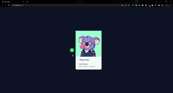
Toggle on Dark Mode
In App.js we will modify the component using the code block below:
...
  <div className="flex items-center justify-center h-screen transition-all bg-primary-light dark:bg-primary-dark">
      <Toggle />
      <figure className="w-64 p-8 mx-4 shadow-xl bg-primary-dark rounded-xl md:p-0 dark:bg-primary-light h-96">
        <img
          className="mx-auto "
          src="https://miro.medium.com/max/980/1*3iesg_sr8kC6NYN2iiFHRQ.png"
          alt="dark"
        />
        <div className="pt-4 space-y-4 text-center md:px-8 md:text-left">
          <blockquote>
            <p className="text-lg font-medium text-primary-light dark:text-primary-dark">
              “Theme day”
            </p>
          </blockquote>
          <figcaption className="font-medium">
            <div className="text-outline-light dark:text-outline-dark">
              Sarah Dayan
            </div>
            <div className="text-secondary-light dark:text-secondary-dark">
              Staff Engineer, Algolia
            </div>
          </figcaption>
        </div>
      </figure>
 </div>
...
From the above code block, we added the variant dark to every markup we intend to use in dark mode.
Conclusion
This article outlines how to implement TailwindCSS into your application and style it with the library's utility classes. In addition, we added dark mode in your React application using TailwindCSS by adding the darkMode property in your Tailwind config file and adding the dark variant on each element. If you want to learn more about the possibilities Tailwind provides, visit the official documentation. You can also find the complete code used in the article in my GitHub Repository, or you can try out the live version.