


A Headless Content Management System(CMS) is any backend-only CMS with an admin interface for managing content, storage, and an API for connecting and consuming data from multiple systems. Without a doubt, the headless cms community is rapidly expanding, and its uniqueness is what propels its success. This innovative approach has earned recognition in the web development and content management industry.
Consider headless CMS to be an API that can be integrated into various platforms.
What is Storyblok?
Storyblok is a headless CMS built with Vue.js that features a visual editor and an easy onboarding process. Storyblok supports up to 15 frameworks; it can be used on multiple platforms and integrated with the framework with which you are most familiar. To build scalable applications, you will need basic experience with any of the frameworks.
Features of Storyblok
Storyblok includes a wide variety of useful features that boost productivity. In this article, I'll walk you through the most important three to get you started and fully understand how Storyblok works from the ground up. The three features we will explore are as follows:
Content
Content is essential because it is where the magic happens. I'll describe it as the place where you add new stories(pages) to your application. In my opinion, each new story you add represents a page.
Block library
The Block library is used to create and manage custom blocks(components). In Storyblok, there are three types of blocks:
Nestable Block: This block type allows you to add new fields to a block.
Content Block: This block type is used to create new stories (pages)
Universal Block: The Universal Block is made up of both the Nestable and Content Blocks.
Assets
Storyblok has an asset management system that allows you to upload various media formats, as well as an image editor to manipulate assets to your liking.
Getting started
In this section, we will create a Next.js application using the command in either of the code blocks below:
yarn create next-app nextjs-storyblok
or
npx create-next-app nextjs-storyblok
After successfully installing Next.js, open the application in your preferred IDE.
Install Dependencies
Following that, we will install Chakra UI to style the application and Storyblok as a dependency so that we can connect to Storyblok using either of the code blocks below:
npm install @storyblok/react @chakra-ui/react @emotion/react @emotion/styled framer-motion
or
yarn add @storyblok/react @chakra-ui/react @emotion/react @emotion/styled framer-motion
Setup Chakra UI with NextJs
Navigate to pages/_app.js and modify it using the code block below:
...
import { ChakraProvider } from '@chakra-ui/react';
...
...
 return (
    <ChakraProvider>
      <Component {...pageProps} />
    </ChakraProvider>
  )
...
Run yarn dev in your terminal to start your application.
Connecting to Storyblok
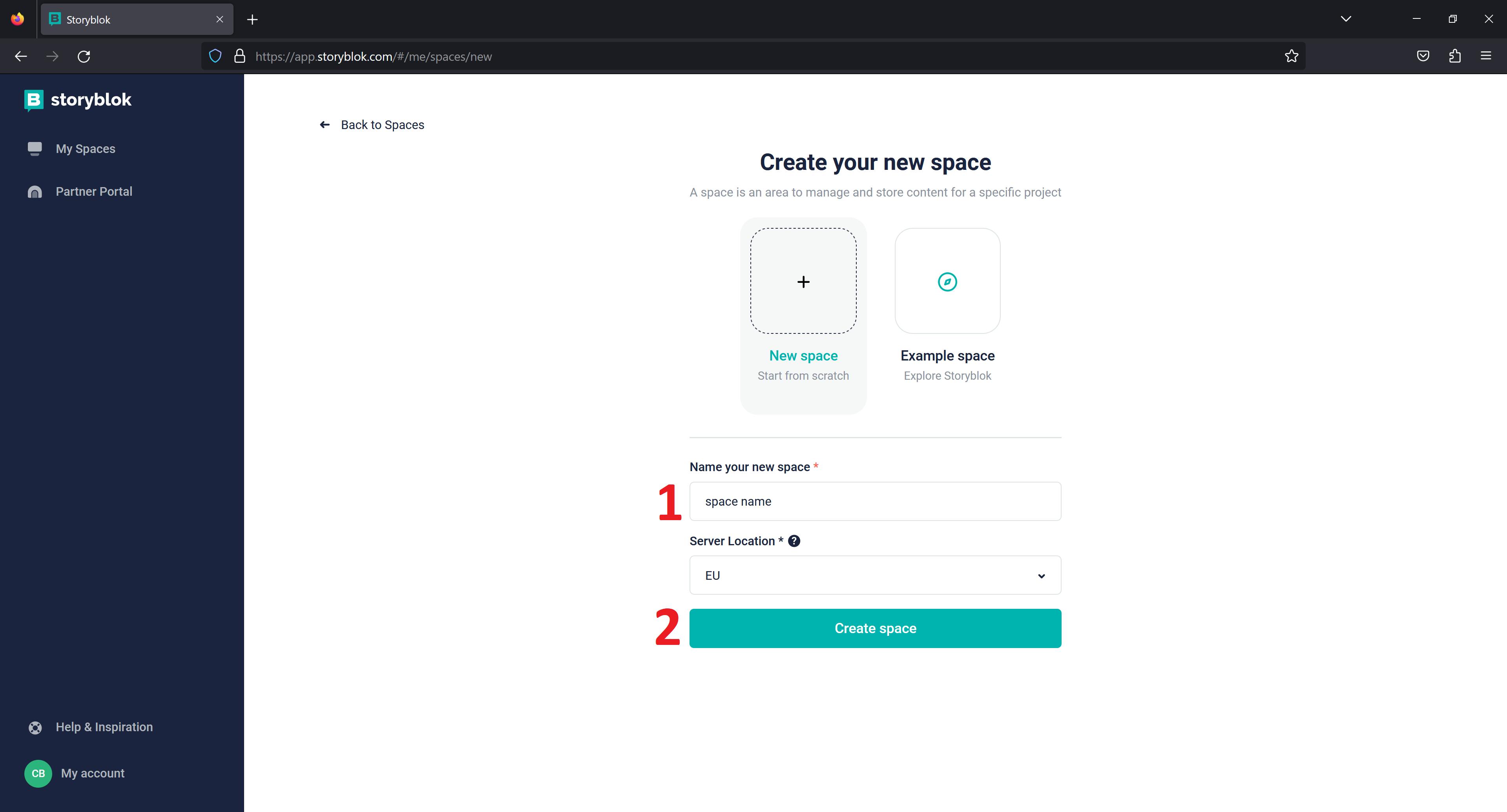
The first step is to create an account and follow the steps to create a space.
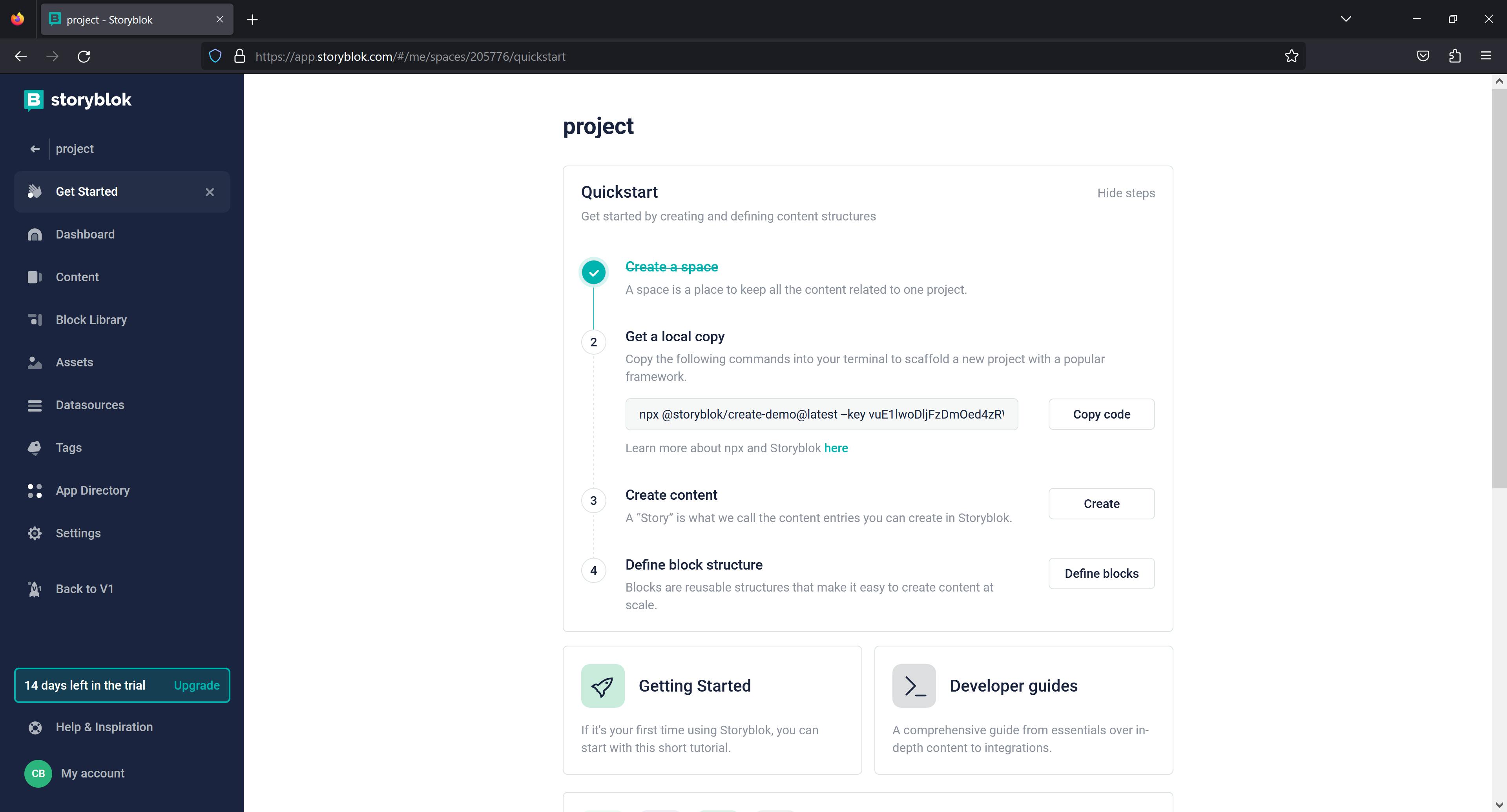
If you already have an account, sign in and create a new space.
Enter a new space name and click Create space.
Configure Storyblok in Next.js
In your Nextjs application, add NEXT_PUBLIC_ACCESS_TOKEN=REPLACE_WITH_YOUR_OWN_TOKEN to the .env.local file. Return to Storyblok and change the preview URL to http://localhost:3000 before saving your changes configure the visual editor. Finally, you must set the real path to /.
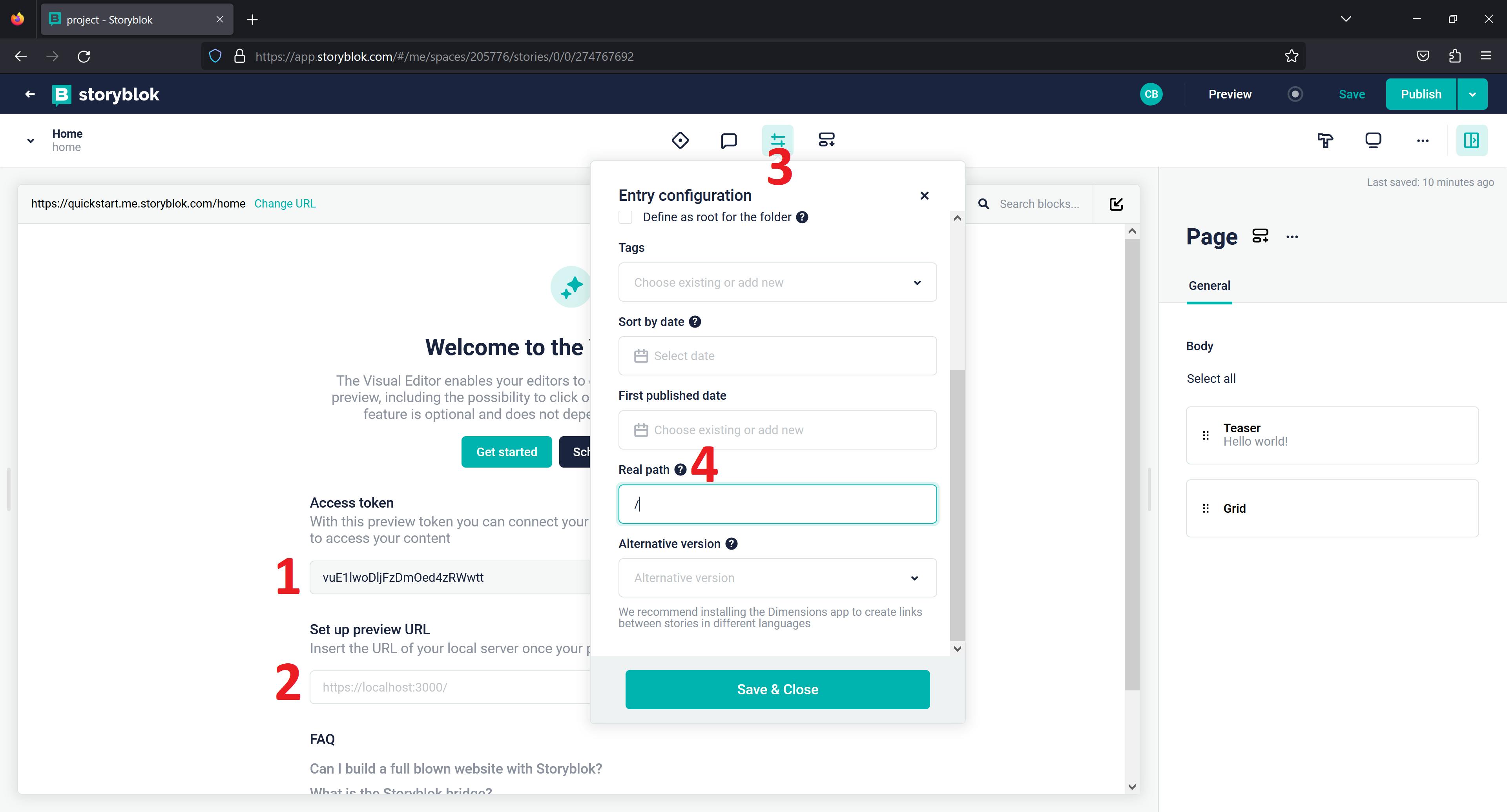
If you're unsure how to set up an HTTPS proxy, use this guide for Windows or macOS provided by the Storyblok team.
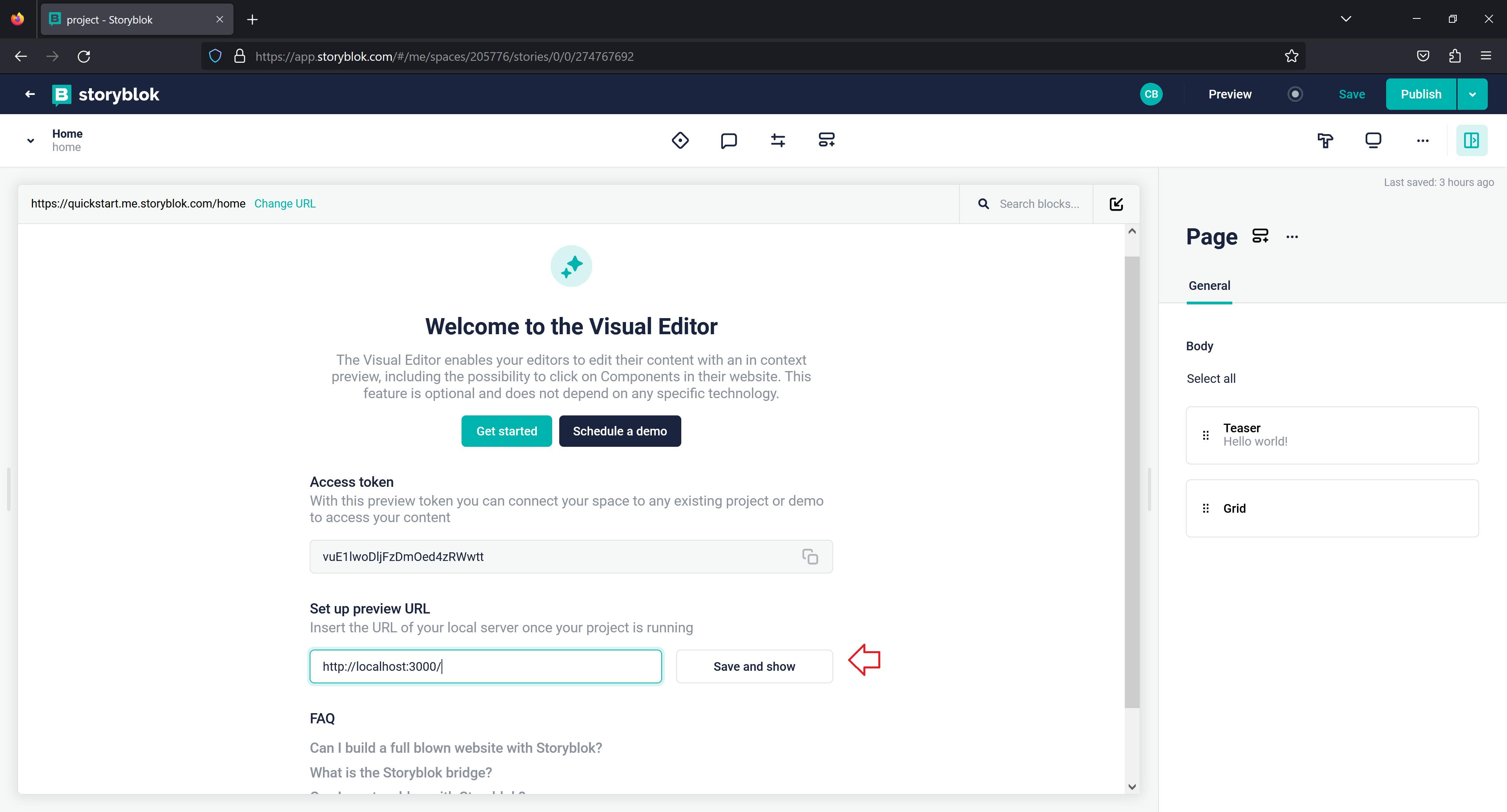
In pages/_app.js, add the below code block to complete the visual editor setup.
...
import { storyblokInit, apiPlugin } from "@storyblok/react";
...
...
storyblokInit({
  accessToken: process.env.NEXT_PUBLIC_ACCESS_TOKEN,
  use: [apiPlugin],
 // { apiOptions: { region: 'us' } } //only if you are in the us
});
...
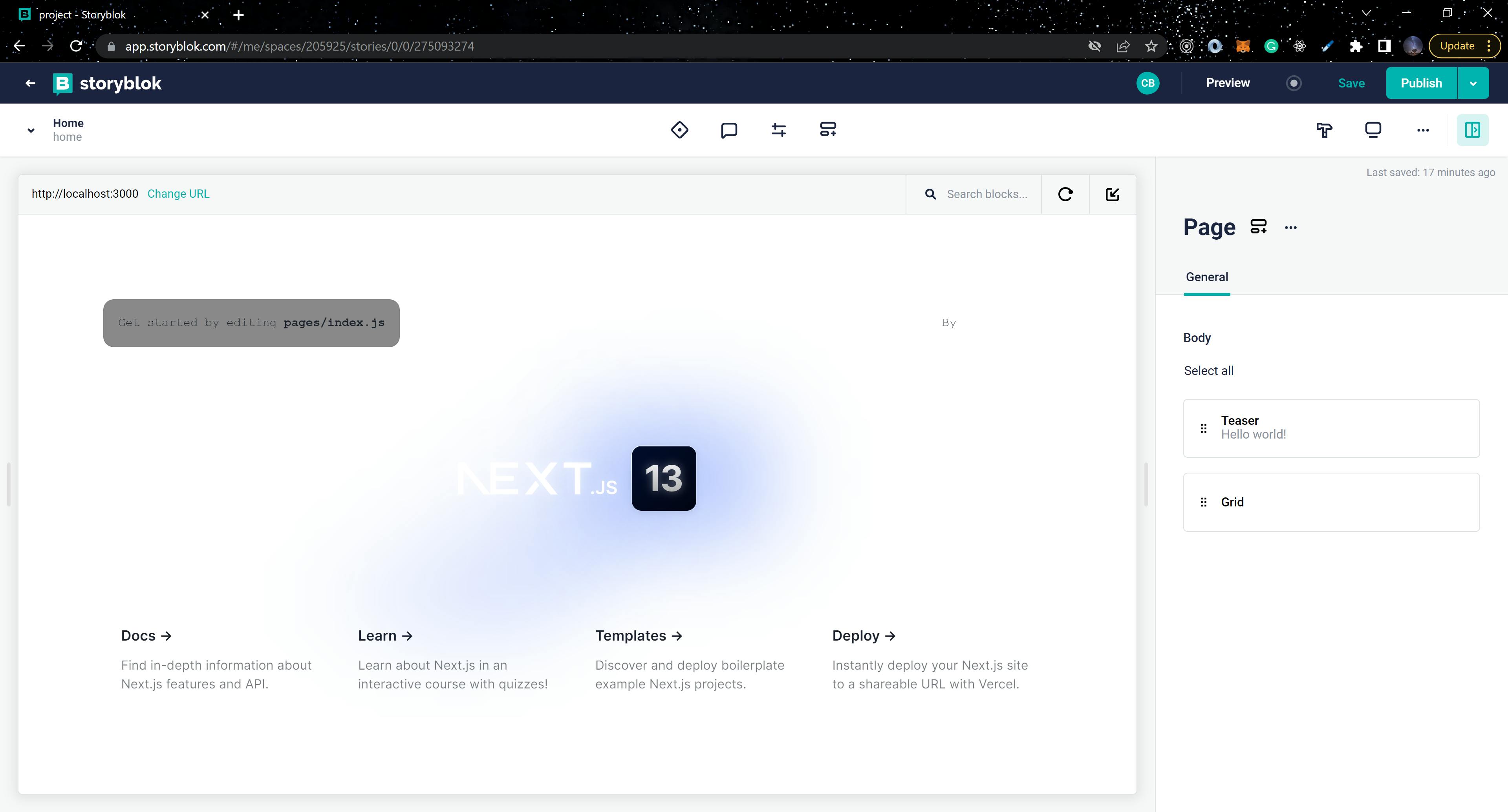
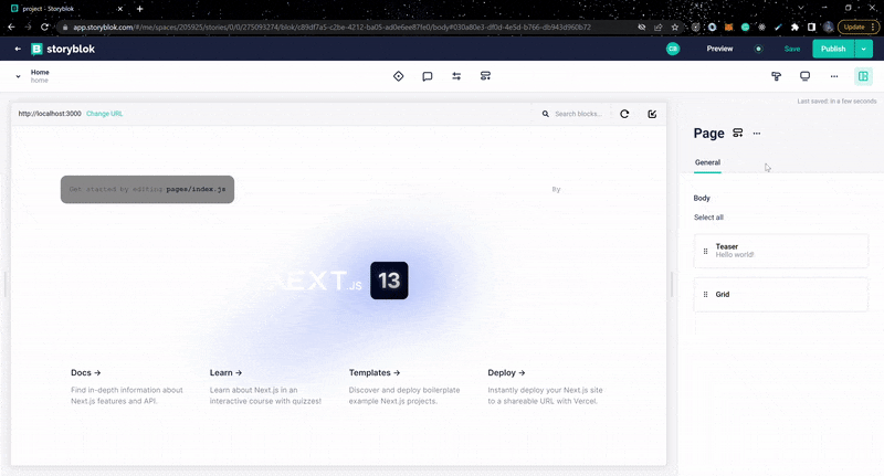
You should be able to see the image below in your visual editor after adding the above code block.
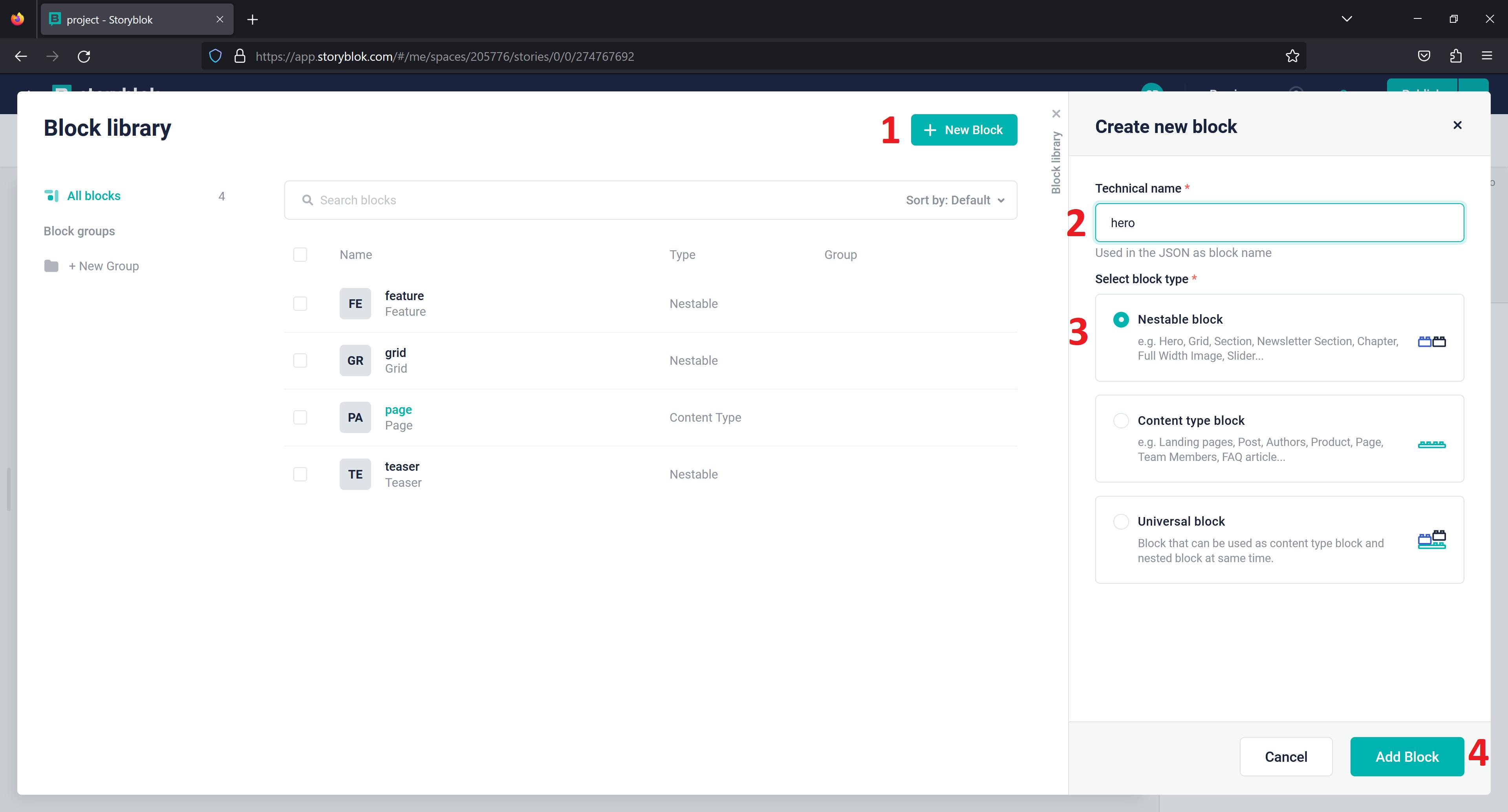
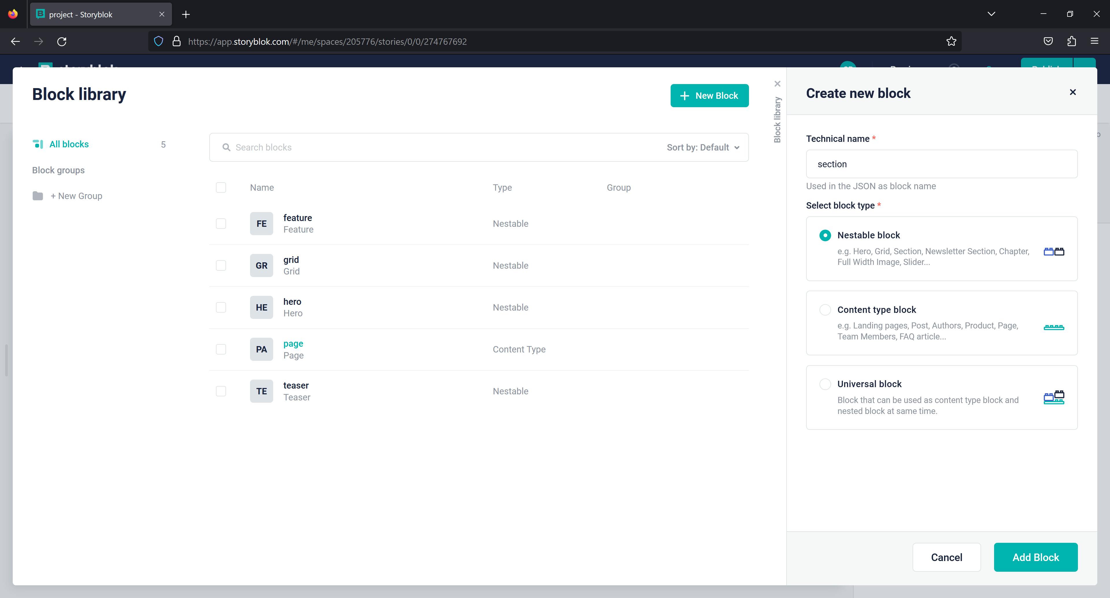
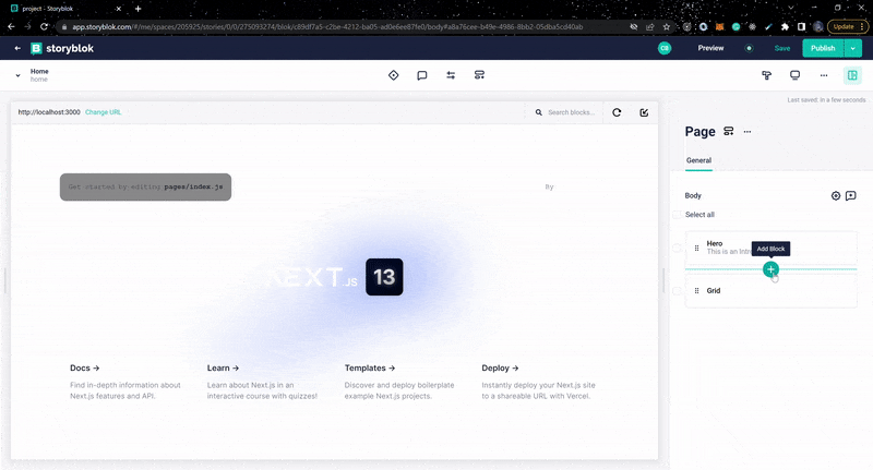
Create New Blocks
In Storyblok, you can create new custom blocks that are tailored to the specific needs of your application. Create the following blocks by clicking the Block library icon.

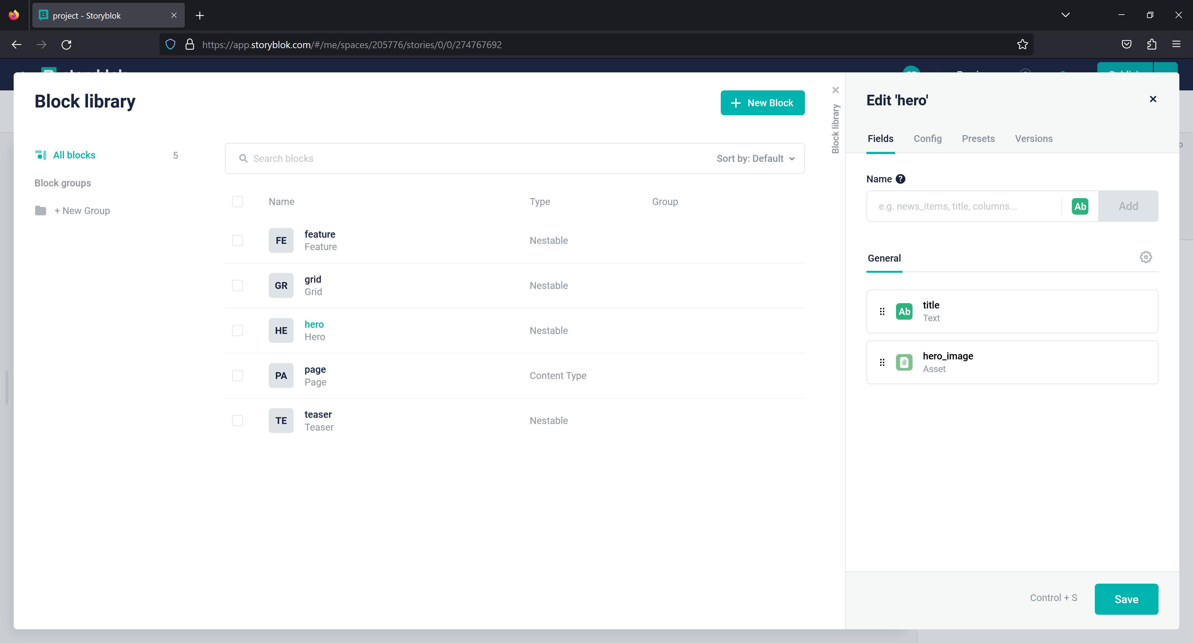
Hero Block
Since we've established that Storyblok has three types of blocks, our Hero block will be a Nestable block.
Click Add Block and enter two fields: hero_image as an Asset field type and title as a Text field type. Changes must be added and saved.
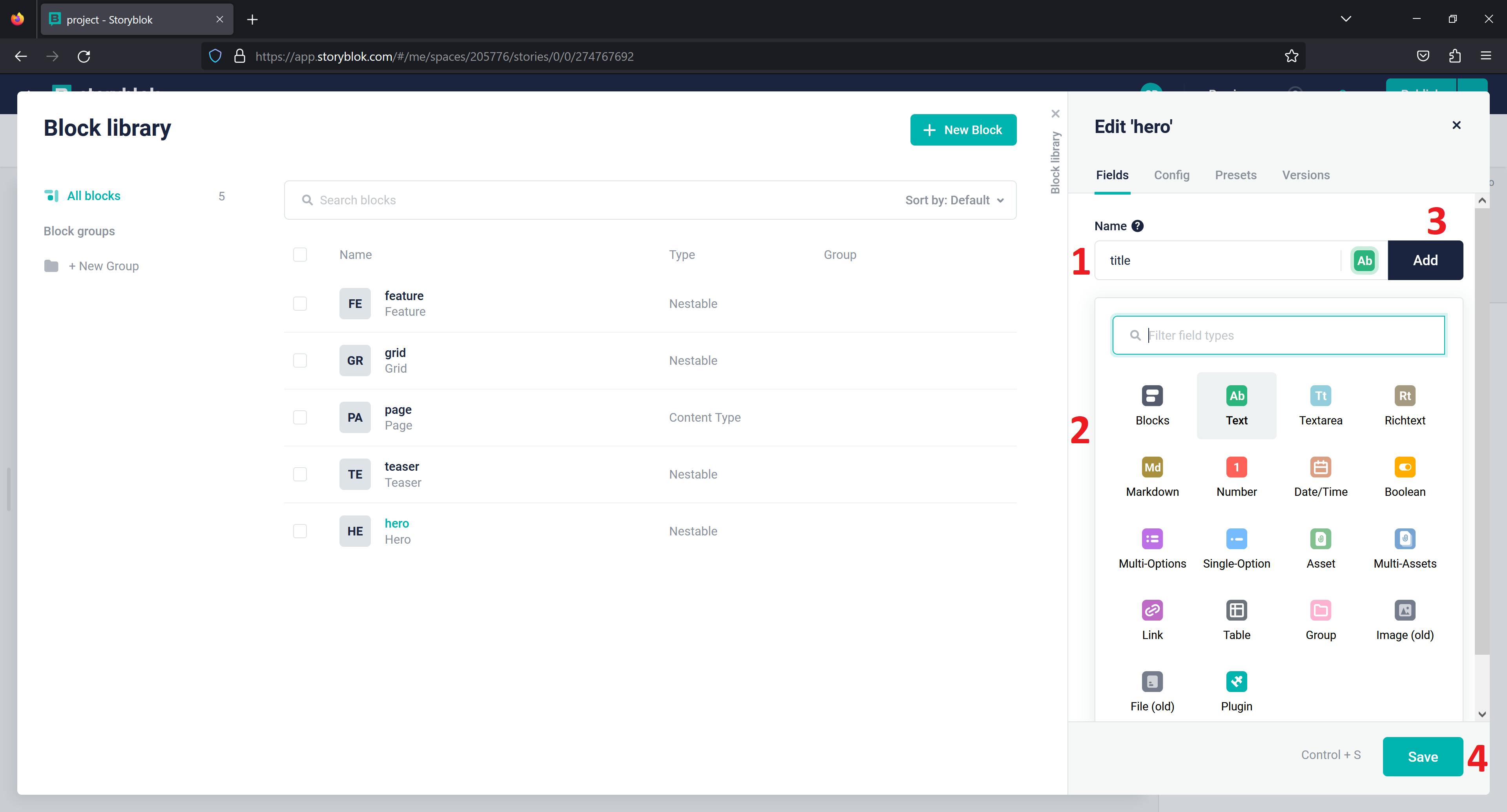
Your Hero Block should have the below fields:
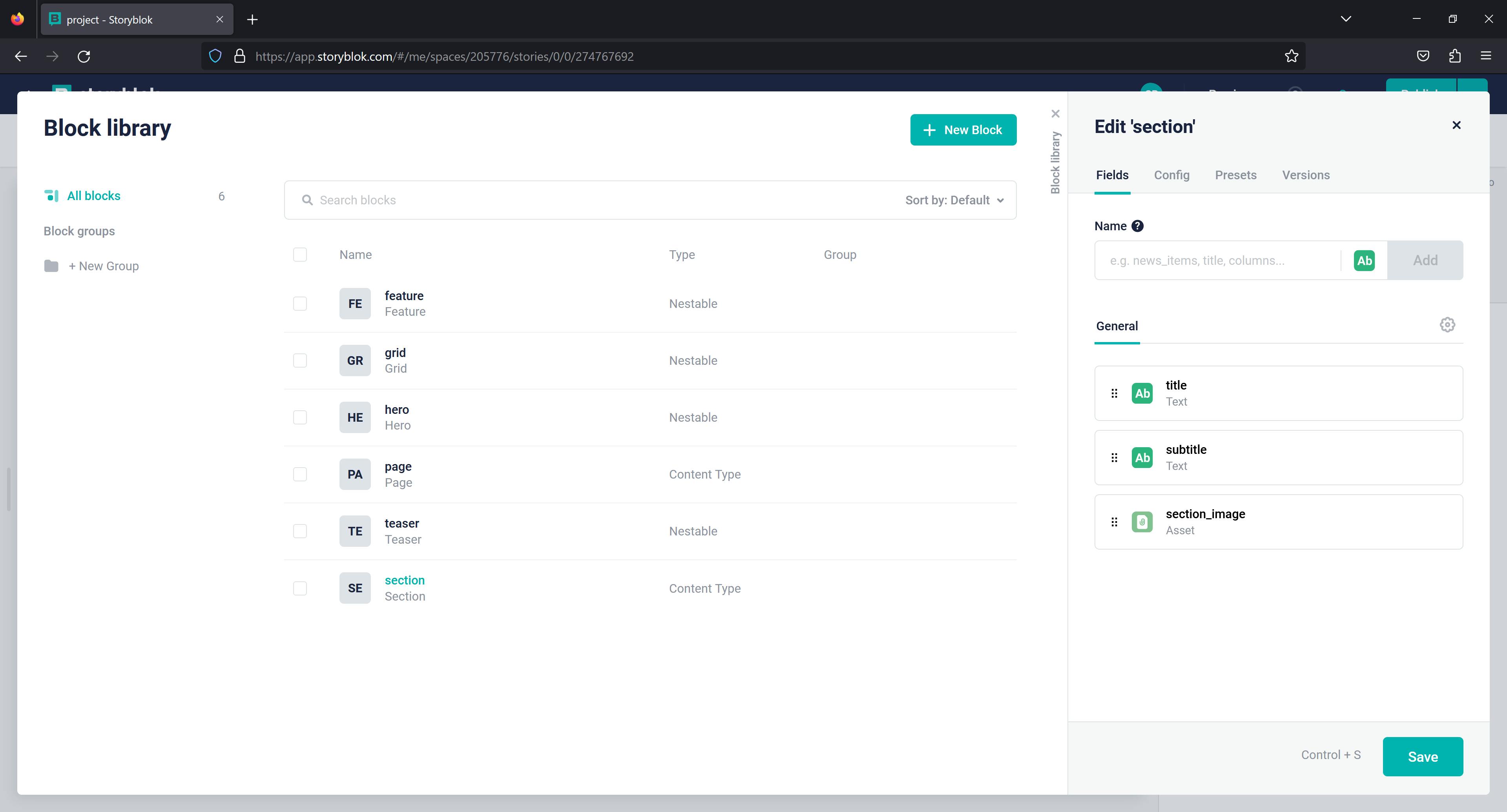
Section Block
The Section Block will be a Nestable block too.
Click Add Block, then enter three fields: section_image as an Asset, title, and subtitle as Text, and save it.
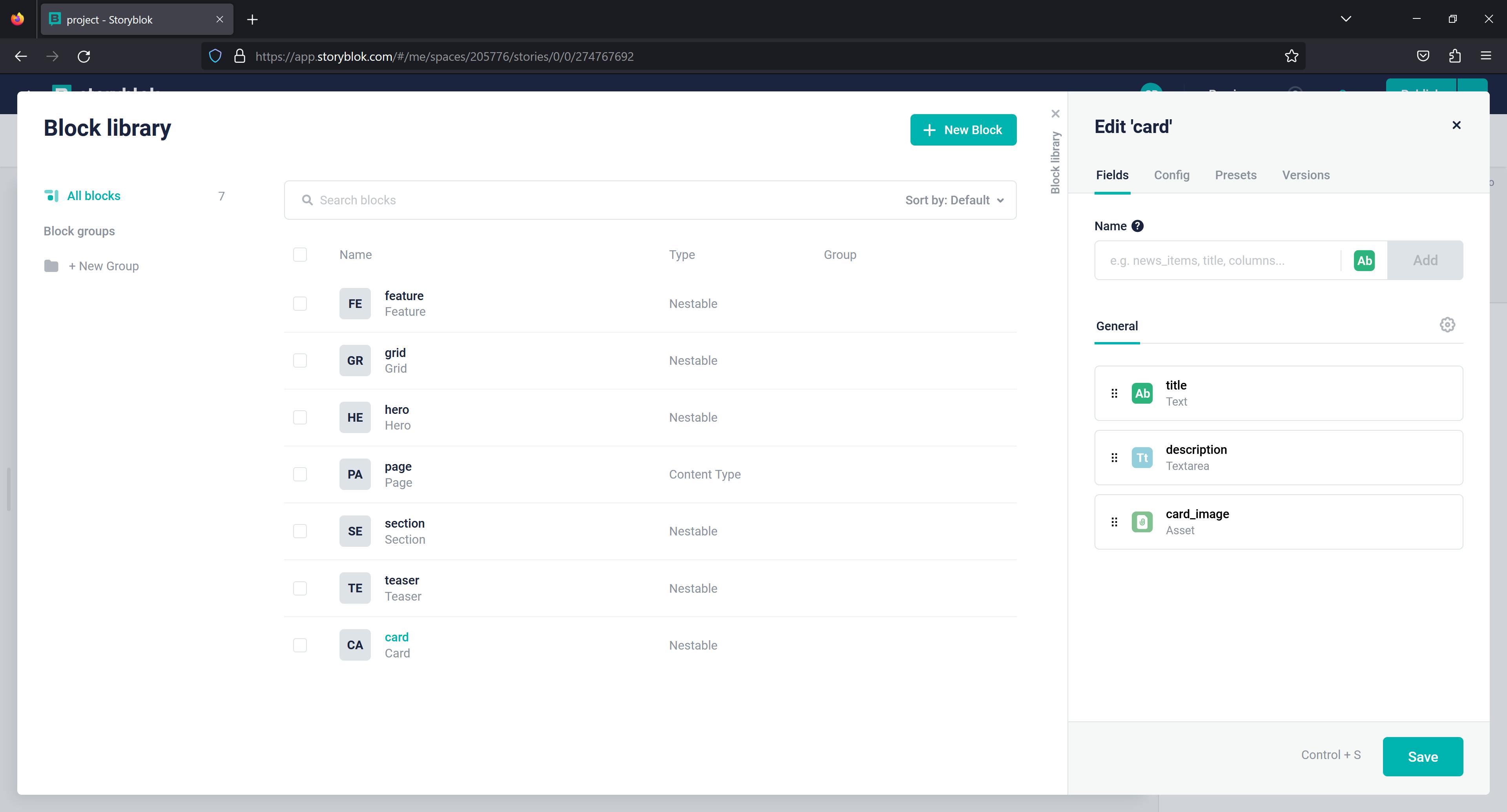
Card Block
The Card Block will be a Nestable block as well.
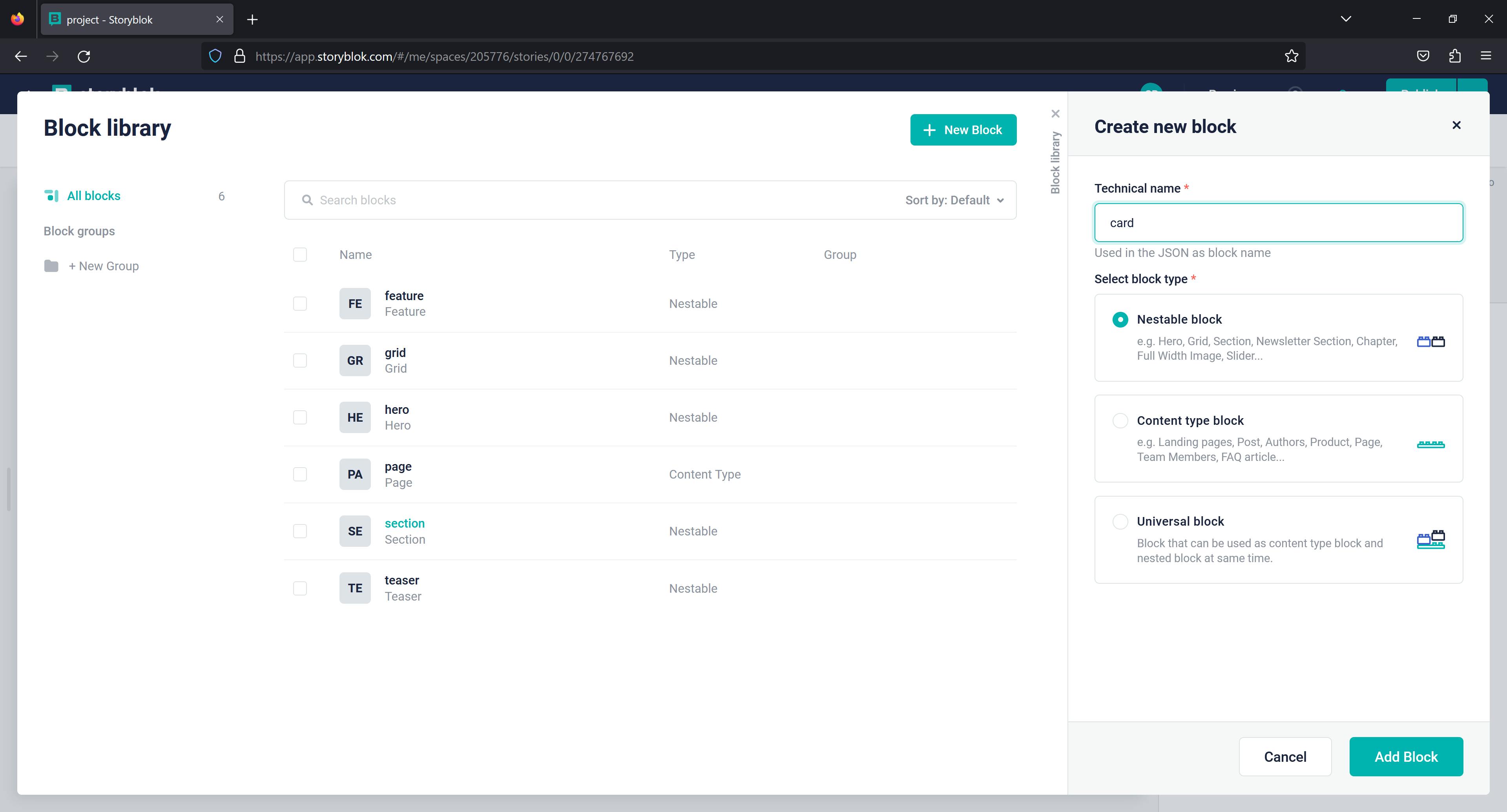
Click Add Block, then enter three fields: card_image as an Asset, name as Text, and description as Textarea, then save it.
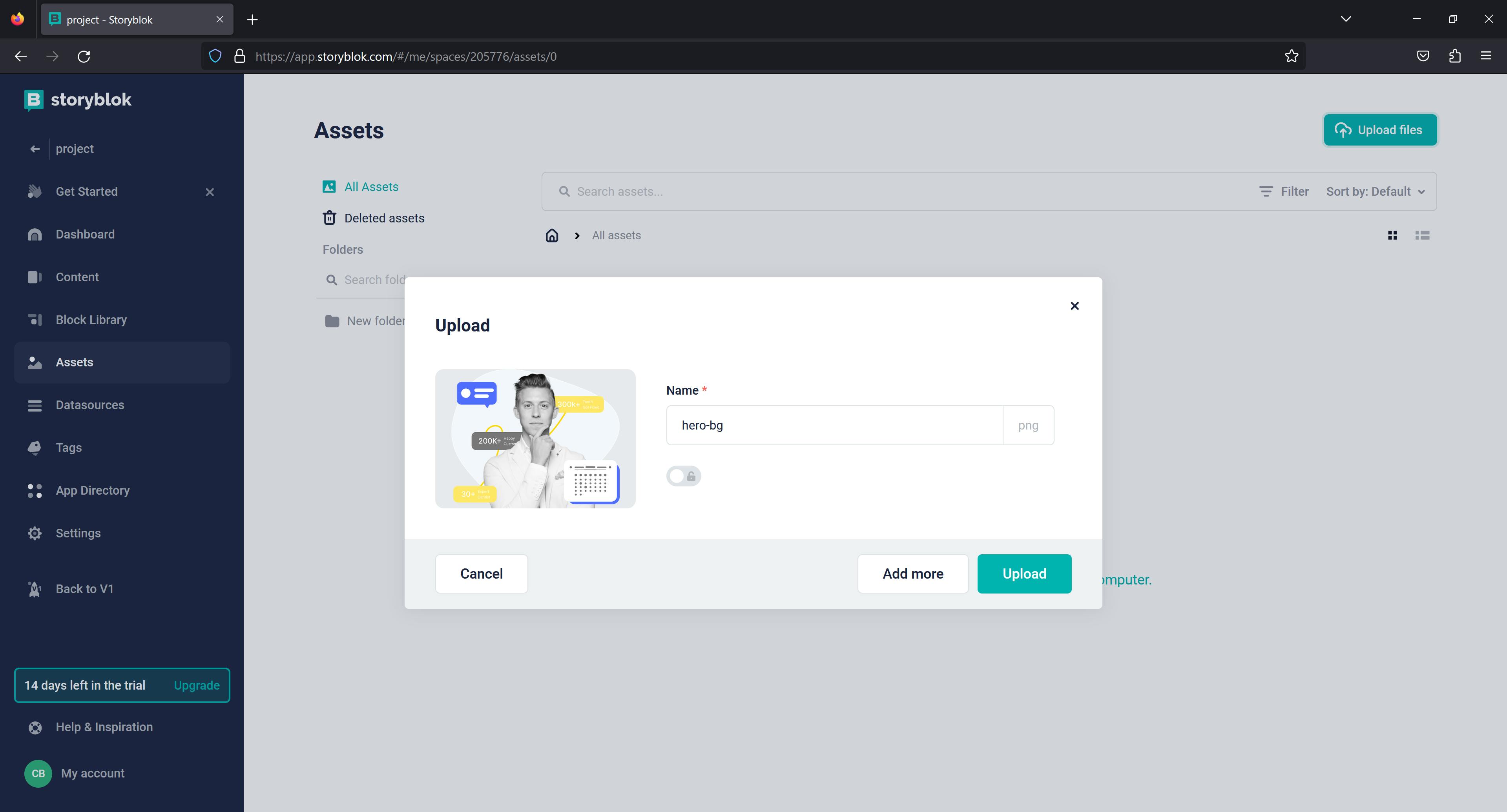
Upload Assets
With Storyblok's asset management system, a user can upload assets to be used in any Story(page) within the same space. To add new assets to your space, go to Assets on the left side of the screen and click Upload files.
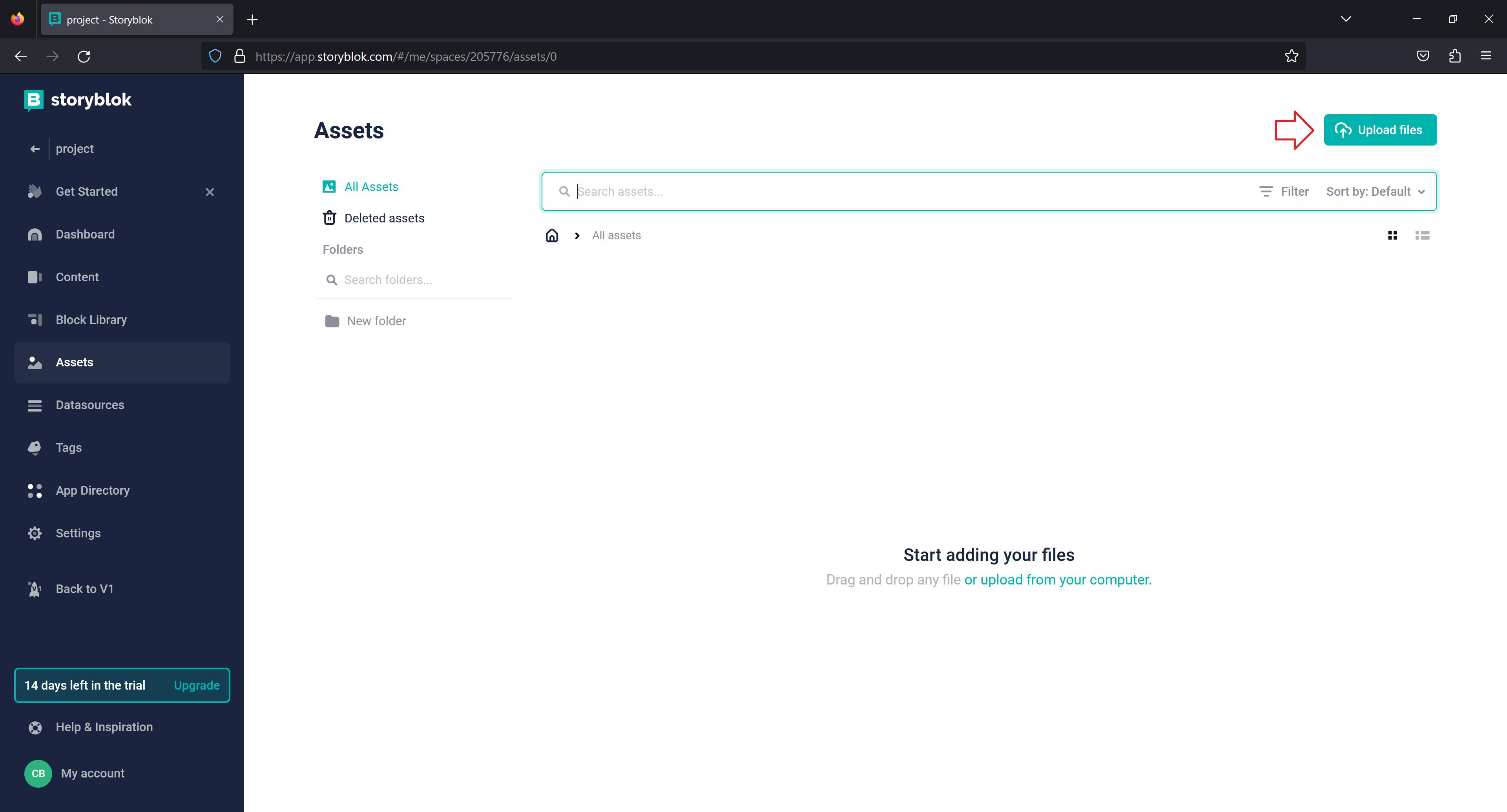
Add as much media as you want.
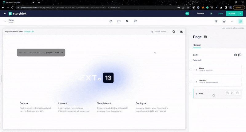
Build with Storyblok
Now that we've successfully created custom blocks, we can use them to build. The image below shows how we will structure our blocks on the page in the following order.
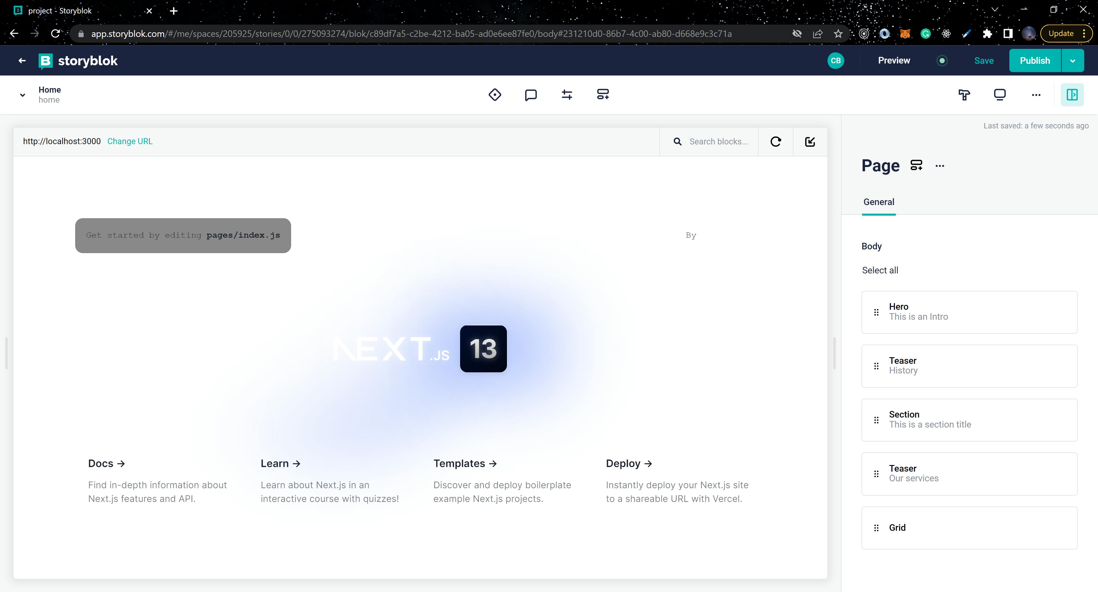
Hero
We'll add the Hero block to the page and fill out the content for the title and hero hero_imagefields.
Section
Add the Section Block to the page and fill out the title, subtitle, and section_image fields with content.
Grid
Since the Grid Block is already on the page, we will add the Card Block to it and fill in the title, description, and card_image fields.
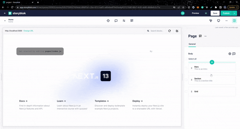
Teaser
Add the Teaser block above the Section Block and the Grid Block. Fill in the content for the headline.
Create Layout
Create a new directory called /components in the root directory of your application and add the following components:
Header
// components/Header.js
import { Box, Button, Flex, Text } from "@chakra-ui/react";
import React from "react";

export default function Header() {
  return (
    <Flex
      justifyContent="center"
      alignItems="center"
      h="120px"
      bg="#fff"
      borderBottom="1px solid #BCBCBC"
    >
      <Box
        display="flex"
        justifyContent="flex-start"
        alignItems="center"
        flex={1}
      >
        <Text
          color="#18181B"
          fontWeight="700"
          lineHeight="32px"
          fontSize="42px"
        >
          Dentics
        </Text>
      </Box>
      <Box display={{ base: "none", md: "block"}}>
        <Button
          bg="#516EFF"
          color="#fff"
          borderRadius="8px"
          fontSize="18px"
          fontWeight="600"
          lineHeight="24px"
          fontFamily="Inter"
          px="40px"
          py="12px"
          h="56px"
          w="187px"
        >
          Appointment
        </Button>
      </Box>
    </Flex>
  );
}
Footer
// components/Footer.js
import { Box, Grid, GridItem, Text } from "@chakra-ui/react";
import React from "react";

export default function Footer() {
  return (
    <Box bg="#516EFF">
      <Box
        py={8}
        px={4}
        display="flex"
        justifyContent="center"
        alignItems="center"
      >
        <Grid
          templateColumns={{ base: "1fr", md: "repeat(3, 1fr)" }}
          justifyContent="center"
          gap={10}
        >
          <GridItem
            borderRight={{
              base: "none",
              md: "1px solid rgba(255, 255, 255, 0.3)",
            }}
            pr={6}
          >
            <Text
              color="#fff"
              fontWeight="400"
              lineHeight="34px"
              fontSize="16px"
              letterSpacing="0.04em"
            >
              We are welcoming you
            </Text>

            <Text
              color="#fff"
              fontWeight="600"
              lineHeight="40px"
              fontSize="28px"
              py={8}
            >
              Want to visit our clinic?
            </Text>

            <Text
              color="#fff"
              fontWeight="400"
              lineHeight="24px"
              fontSize="14px"
              letterSpacing="0.04em"
            >
              Saturday - Thrusday <br />
              10 am- 9 pm
            </Text>
          </GridItem>
          <GridItem
            borderRight={{
              base: "none",
              md: "1px solid rgba(255, 255, 255, 0.3)",
            }}
            pr={6}
          >
            <Text
              color="#fff"
              fontWeight="400"
              lineHeight="34px"
              fontSize="16px"
              letterSpacing="0.04em"
            >
              Important link
            </Text>

            <Text
              color="#fff"
              fontWeight="600"
              lineHeight="40px"
              fontSize="28px"
              py={8}
            >
              Want to visit our clinic?
            </Text>

            <Text
              color="#fff"
              fontWeight="400"
              lineHeight="24px"
              fontSize="14px"
              letterSpacing="0.04em"
            >
              Saturday - Thursday <br />
              10 am- 9 pm
            </Text>
          </GridItem>
          <GridItem pr={6}>
            <Text
              color="#fff"
              fontWeight="400"
              lineHeight="34px"
              fontSize="16px"
              letterSpacing="0.04em"
            >
              Say hello to us
            </Text>

            <Text
              color="#fff"
              fontWeight="400"
              lineHeight="34px"
              fontSize="16px"
              letterSpacing="0.04em"
              py={6}
            >
              hello@reallygreatsite.com
            </Text>

            <Text
              color="#fff"
              fontWeight="400"
              lineHeight="24px"
              fontSize="14px"
              letterSpacing="0.04em"
            >
              Address <br />
              123 Anywhere St., Any <br />
              City, NY 39200
            </Text>
          </GridItem>
        </Grid>
      </Box>
      <Box bg=" #216583" py="20px">
        <Text
          color="#fff"
          fontWeight="400"
          fontSize="16px"
          lineHeight="24px"
          textAlign="center"
        >
          © 2001-2022, All Rights Reserved
        </Text>
      </Box>
    </Box>
  );
}
Layout
// components/Layout.js
import { Container } from "@chakra-ui/react";
import React from "react";
import Header from "./Header";
import Footer from "./Footer";

export default function Layout({ children }) {
  return (
    <Container maxW="1440px">
      <Header />
      {children}
      <Footer />
    </Container>
  );
}
Navigate to pages/index.js and add the below code block:
...
export default function Home(props) {
  const story = useStoryblokState(props.story);

  return (
    <>
      <Head>
        <title>Create Next App</title>
        <meta name="description" content="Generated by create next app" />
        <meta name="viewport" content="width=device-width, initial-scale=1" />
        <link rel="icon" href="/favicon.ico" />
      </Head>
      <Layout >
        <StoryblokComponent blok={story.content} />
      </Layout>
    </>
  );
}


export async function getStaticProps() {
  // home is the default slug for the homepage in Storyblok
  let slug = "home";

  // load the draft version
  let sbParams = {
    version: "draft", // or 'published'
  };

  const storyblokApi = getStoryblokApi();
  let { data } = await storyblokApi.get(`cdn/stories/${slug}`, sbParams);

  return {
    props: {
      story: data ? data.story : false,
      key: data ? data.story.id : false,
    },
    revalidate: 3600, // revalidate every hour
  };
}
In the above code block, we used Next. js getStaticProps and getStoryblokApi to fetch data from Storyblok and store the data in useStoryblokState, then we pass the data to the blok prop of StoryblokComponent allows the rest of the components to access our data from Storyblok.
Sync the blocks into Next.js
In this section, we will create components for the blocks we created in our Block library. Navigate to the /components directory in your application and include the following components:
Page
// components/Page.js
import { Box } from "@chakra-ui/react";
import { storyblokEditable, StoryblokComponent } from "@storyblok/react";

const Page = ({blok}) => (
  <Box {...storyblokEditable(blok)}>
    {blok.body.map((nestedBlok) => (
      <StoryblokComponent blok={nestedBlok} key={nestedBlok._uid} />
    ))}
  </Box>
);

export default Page;
Grid
// components/Grid.js
import { storyblokEditable, StoryblokComponent } from "@storyblok/react";
import { Grid as GridContainer } from "@chakra-ui/react";

const Grid = ({ blok }) => {
  return (
    <GridContainer
      templateColumns={{base: "1fr", md: "repeat(3, 1fr)"}}
      gap={4}
      {...storyblokEditable(blok)}
    >
      {blok.columns.map((nestedBlok) => (
        <StoryblokComponent blok={nestedBlok} key={nestedBlok._uid} />
      ))}
    </GridContainer>
  );
};

export default Grid;
Hero
// components/Hero.js
import { storyblokEditable } from "@storyblok/react";
import { Text, Flex, Box, Image, Button, Heading } from "@chakra-ui/react";

const Hero = ({ blok }) => {
  return (
    <Flex
      Box
      h="100vh"
      w="100%"
      justifyContent="space-between"
      alignItems="center"
      gap={4}
      {...storyblokEditable(blok)}
    >
      <Flex flexDirection="column" flex={1} justifyContent="center" mt={-4}>
        <Heading
          fontWeight="700"
          fontSize="54px"
          lineHeight="74px"
          color="#18181B"
          textTransform="capitalize"
          my={4}
        >
          {blok.title}
        </Heading>
        <Text
          fontSize="20px"
          lineHeight="34px"
          color="#777"
          fontWeight="400"
          mb={8}
        >
          {blok.description}
        </Text>
        <Box display="flex" gap={8}>
          <Button
            bg="#516EFF"
            color="#fff"
            borderRadius="8px"
            fontSize="18px"
            fontWeight="600"
            lineHeight="24px"
            fontFamily="Inter"
            px="40px"
            py="12px"
            h="56px"
            w="197px"
          >
            Get Started
          </Button>
          <Button
            bg="transparent"
            color="#52525B"
            borderRadius="8px"
            fontSize="18px"
            fontWeight="600"
            lineHeight="24px"
            fontFamily="Inter"
            border="1px solid #52525B"
            px="40px"
            py="12px"
            h="56px"
            w="195px"
            display={{ base: "none", md: "block" }}
          >
            Learn More
          </Button>
        </Box>
      </Flex>
      <Flex
        flex={1}
        alignItems="center"
        justifyContent="flex-end"
        display={{ base: "none", md: "block" }}
        w="100%"
      >
        <Image
          src={blok.hero_image.filename}
          h="496px"
          w="auto"
          objectFit="contain"
          alt="hero-bg"
        />
      </Flex>
    </Flex>
  );
};

export default Hero;
Custom Card
// components/CustomCard.js
import {
  Card,
  CardBody,
  CardHeader,
  Heading,
  Image,
  Text,
} from "@chakra-ui/react";
import React from "react";

export default function CustomCard(service) {
  return (
    <Card maxW="100%" w="100%" my={4}>
      <Image
        objectFit="cover"
        src={service.service.card_image?.filename}
        h="300px"
        w="full"
        alt="Chakra UI"
      />
      <CardHeader>
        <Heading as="h3" color="#000" size="sm">
          {service.service.title}
        </Heading>
      </CardHeader>
      <CardBody>
        <Text>{service.service.description}</Text>
      </CardBody>
    </Card>
  );
}
Card
// components/Card.js
import { storyblokEditable } from "@storyblok/react";
import { Grid } from "@chakra-ui/react";
import CustomCard from "./CustomCard";

const Card = ({ blok }) => (
    <Grid
      templateColumns={{ base: "1fr", md: "repeat(1, 1fr)" }}
      justifyContent="center"
      gap={4}
      {...storyblokEditable(blok)}
      mb={4}
    >
      <CustomCard service={blok} />
    </Grid>
);

export default Card;
Section
// components/Section.js
import { storyblokEditable } from "@storyblok/react";
import { Flex, Image, Text } from "@chakra-ui/react";

const Section = ({ blok }) => (
  <Flex
    justifyContent={{md: "center", lg: "space-between"}}
    alignItems="center"
    mb={8}
    {...storyblokEditable(blok)}
    gap={4}

  >
    <Flex
      flex={1}
      display={{ base: "none", md: "none",  lg: "block" }}
      w="100%"
      justifyContent="flex-start"
      alignItems="center"
    >
      <Image
        src={blok.section_image.filename}
        h="340px"
        w="auto"
        objectFit="contain"
        alt="Section Image"
      />
    </Flex>
    <Flex
      flexDirection="column"
      bg="#F8FAFC"
      borderRadius="16px"
      border="1px solid rgba(82, 82, 91, 0.1)"
      w="634px"
      px={{ base: 4, md: "4rem"}}
      py={{ base: 4, md: "2rem"}}
    >
      <Text fontSize="24px" fontWeight="500" lineHeight="34px" color="#18181B">
        {blok.title}
      </Text>
      <Text
        fontSize="16px"
        fontWeight="400"
        lineHeight="34px"
        letterSpacing="0.04em"
        color="#777"
        my={4}
      >
        {blok.subtitle}
      </Text>
    </Flex>
  </Flex>
);

export default Section;
Teaser
// components/Teaser.js
import { storyblokEditable } from "@storyblok/react";
import { Box, Text } from "@chakra-ui/react";

const Teaser = ({ blok }) => (
  <Box justifyContent="flex-start" {...storyblokEditable(blok)} py={4}>
    <Text
      fontWeight="700"
      fontSize="42px"
      lineHeight="42px"
      color="#000"
    >
      {blok.headline}
    </Text>
  </Box>
);

export default Teaser;
Navigate to _app.js and modify it with the below code block:
...
import Card from "@/components/Card";
import Grid from "@/components/Grid";
import Hero from "@/components/Hero";
import Page from "@/components/Page";
import Section from "@/components/Section";
import Teaser from "@/components/Teaser";
...
...
const components = {
  grid: Grid,
  hero: Hero,
  card: Card,
  section: Section,
  teaser: Teaser,
  page: Page,
};

storyblokInit({
  ...
  components,
  ...
});
...
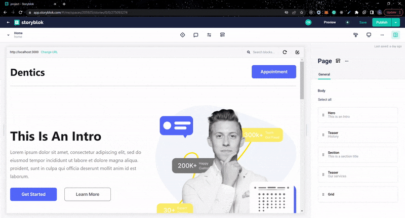
Your Visual Editor should have a similar result below or view it on localhost:3000 on your browser.
Conclusion
In this article, we explored how to integrate Storyblok headless CMS into a Next.js application, as well as three Storyblok features. Check out their documentation if you want to learn more about Storyblok. The source code for the project used in this article can also be found in this GitHub repository.